
Introducing Mocha Mousse: 2025’s Pantone Color of the Year
Similar to Behr Paint, Valspar Color, and Benjamin Moore, the Pantone Color Institute’s experts select one standout shade each year, giving it the spotlight for the next 12 months. This tradition is designed to encourage people to experiment with new colors they might not have considered, while also sparking creativity in interior design nationwide.
For 2025, Pantone has chosen Mocha Mousse as the color of the year. Previous selections, such as Peach Fuzz, Viva Magenta, and Very Peri, reflected the moods and trends of their respective years. Now that we know what color will dominate this year, we’re excited to offer ideas on how to bring it into your home.

Using This Color in Your Home
As we step into the new year, Pantone unveils its Color of the Year, a shade that embodies the global mood and captures the collective spirit of the moment. This color reflects a shared attitude, offering a distinct hue that resonates with current cultural trends.
You might assume that incorporating this bold color requires a complete home makeover, but that’s not necessarily the case. While a full redesign is one option, there are plenty of creative ways to weave this trendy hue into your home without overhauling everything. Here are a few ideas for infusing this 2025 color into your space.
Focal Feature Wall
This velvety brown shade is incredibly versatile, allowing you to pair it with a wide range of colors. For a striking yet balanced look, consider using Mocha Mousse as an accent wall. This rich, cozy hue creates a warm and inviting focal point, bringing a sense of calm—even in the busiest of homes. Complement it with soft neutrals like cream or light gray, or make a bold statement with a vibrant contrast.
Full Room Repaint
Thinking about refreshing your home’s color palette? A rich, luxurious brown might be just what you need. This warm and inviting shade instantly adds coziness, making any space feel more welcoming for both you and your guests. Try Mocha Mousse in intimate areas like a powder room, home office, or small living room for a sophisticated, cocoon-like ambiance. Alternatively, embrace a full home refresh by incorporating different complementary shades in each room for a cohesive yet dynamic redesign.
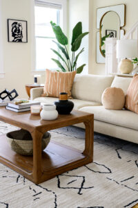
Cozy Sofas and Chairs
If you don’t want to introduce the color in the form of paint, you’ve got plenty of alternatives. Take furniture, for instance. What better way to unwind after a long day than by sinking into a sofa in the shade of chocolate and coffee? You can use brown sofas or armchairs as a foundation to complement various home decor styles. This safe color also pairs nicely with several aesthetics, making it an easy way to stay on trend without making your home look disjointed.
Warm Cabinetry
Mocha Mousse isn’t reserved for walls and furniture. You can utilize it in your kitchen for a delectable look that will inspire you to make mouthwatering baked goods all year round. Use brown and other similar tones for kitchen cabinets paired with gold hardware or natural wood tones. Also, this shade can make your bathroom feel like a five-star spa — the perfect place to start your day or get ready for bed at night.
Neutral Throws and Decor
Brown is a perfect addition to your house because you can use it all year — it matches the colors of all the seasons if used intentionally. One way to disperse this hue gracefully is through comfortable elements and decor. Add texture and warmth with throws and cushions in Mocha Mousse, hang up brown painted frames and place neutral candle sticks on your mantel. Whatever you can do to make the space more inviting while also scattering this color throughout is a win.
Big Area Rugs
If the rest of your room is busy with color or patterns, a solid-brown area rug acts as an anchor, laying a strong foundation for the rest of the space to build on. Not only does the color look chic and high-class, but using it in an area rug ensures the room is cohesive from floor to ceiling — let’s face it, sometimes the floor is forgotten in redesign projects.
What Colors To Pair With Mocha Mousse
Generally, you don’t want to introduce a new color without first knowing if it will work with the existing shades. Lucky for you, Mocha Mousse matches so many colors, making it the perfect hue to add to your palette. And to make your choices easier, Pantone created five unique color combinations to complement their shade of choice for the new year:
Relaxed Elegance
This neutral color palette includes beautiful, subtle colors that will make you feel wrapped in a chic hug:
- Cannoli Cream.
- Cream Tan.
- Safari.
- Sirocco.
- Chanterelle.
- Baltic Amber.
- Chocolate Martini.
What Pantone has to say about it: “Revel in your own special moments. Imbued with a sensorial richness, PANTONE 17-1230 Mocha Mousse inspires us to curate experiences that boost personal comfort and wellness. From sweet treats to nature walks, the indulgence of simple pleasures that we can also gift and share with others.”
Floral Pathways
For a bouquet of stunning shades, select pastels and nature-inspired tones:
- Tendril.
- Cornflower Blue.
- Viola.
- Rose Tan.
- Cobblestone.
- Willow.
- Gardenia.
What Pantone has to say about it: “A cornucopia of suggestively scented floral tones, blended with a soft mocha and a shaded willow green, leads us down a cobblestone path.”
Uniquely Balanced
With a mix of warm and cool tones, Uniquely Balanced brings harmony and symmetry:
- Blue Jewel.
- Desert Flower.
- Cattleya Orchid.
- Spicy Mustard.
- Opera Mauve.
- Blue Curacao.
- Arabesque.
What Pantone has to say about it: “Mocha Mousse nestles in, offsetting the vibrancy of this uniquely balanced, multi-colored and somewhat exotic grouping of tones both warm and cool.”
Deliciousness
Want your space to look like summer incarnate? Warm, pinky tones are the way to go:
- Bonbon.
- Party Punch.
- Winery.
- Mandarin Orange.
- Pink Lemonade.
- Caramel.
- Peach Cobbler.
What Pantone has to say about it: Tastefully tempting Mocha Mousse combines with other delicious hues in a delectable color palette inspired by mouth-watering confections.
Subtle Contrasts
For a darker take on Mocha Mousse, bring a collection of shadowy yet glamorous colors together:
- Tapestry.
- Laurel Oak.
- Coffee Quartz.
- Arona.
- Warm Taupe.
- Dull Gold.
- Buffed Beige.
What Pantone has to say about it: “Sophisticated brown hues coalesce with nuanced contrasts of blue and gray for a classic and compatible statement.”
Some other general colors that would look stunning paired with Mocha Mousse are:
- Muted terracotta: Brings warmth and complements Mocha Mousse’s earthy tone.
- Olive green: Adds a natural and grounding vibe.
- Creamy beige: A soft contrast to enhance brown’s depth.
- Deep navy: Creates a refined and dramatic contrast.
- Gold: Adds luxurious touches that harmonize with the trending color.
- Rich burgundy: Enhances the richness for a warm, opulent look.
- Blush pink: Offers a delicate, romantic pairing.
- Pale lavender: A calming and sophisticated counterpart.
- Light gray: Balances the warmth with cool neutrality.
- Teal or turquoise: Adds a pop of vibrant, contemporary energy.
- Mustard yellow: A lively complement for dynamic palettes.
- Coral: Balances warmth with a cheerful tone.
Have a Design Partner for 2025
Having a new color to use as inspiration also means you have countless opportunities to incorporate it into your home. Exciting! When preparing your space for a new coat of paint, it pays to have a partner who executes your vision perfectly.
Ready to start your new year off on the right foot?
Ready to Get Your Project Started?
ETM Interiors - Decorating Den Interiors helps customers create beautiful and unique living spaces.
Let us help you with your next big project!